
After


Before
Multi-Coverage Insurance Evaluator
An independent insurance agency tasked us with redesigning their internal management platform. They were having difficulty with the efficiency of inputting client information into a module on their product. Managers wanted to spend less time training new hires and it was taking even seasoned employees considerable amounts of extra time to fill it out information.
Another possibility they wanted us to consider was how to make multiple proposals of insurance packages presentable to clients. While clients trusted their agents to give them the best plan, there can be a lot of nuance to the conversation and they wanted to be as transparent as possible on what is the best solution for each household. Currently to look at different packages, they had to create completely different applications rather than being able to compare side by side in one application.
Role
UX Designer, Information Architect
Date
May 2024 - Jan 2025
DiscoveR
Main Priorities
-
Manage and communicate with clients
-
They are the face to face, you call your account manager, you call your insurance agent, that is the role they are filling
-
-
Cross selling
-
If you are obtaining insurance such as home, they want the ability to add other lines like auto, life, and umbrella at the same time to save the clients time and money
-
-
Intimate knowledge of insurance policies
-
Expected to have the knowledge of the difference between each of the carriers and how to bridge the gap between new hires and seasoned employees with lots of experience
-
User Groups
During our discovery sessions with their team, we were able to define the main users of the product and how different roles played into the process.
Internal
-
Account manager
-
PL (Personal Lines) Support Specialist
-
Team Lead / Manager
-
Claims Personnel
-
Community Producer
-
PL Director
External
-
Typical family (PRIMARY)
-
Full coverage (home, auto, umbrella, life)
-
Settled into a home
-
Has kids that are driving or will be soon
-
Possible vacation homes with toys
-
Wants to manage low level changes online
-
Wants to be able to call / email an advisor with questions
-
-
Young Adult
-
LOB: Renter's, Auto
-
Mostly want to communicate online rather than call unless they are very confused
-
Not high revenue, but grow into typical family personas so are still important
-
-
Elder / Estate with POA
-
LOB: Home (small), Auto
-
Typically as a child or someone else that handles their account
-
Majority of changes are done through the phone or email, little usage of online
-
What are the goals of the product?
-
Writing new business
-
Change current business
-
You have auto, you want to change the limits or change the auto as a whole because the vehicle has traded or sold for a new one.
-
-
Cross sell to new lines
-
The retention of the client goes up dramatically the more lines of business you have. So the more that you can cross-sell, the more loyal customers they have for their agency.
-
-
Cancel business
-
Re-market / Renew accounts
-
Every time a policy renews, they need a system to be able to check and make sure it happens smoothly and there are no holds.
-
-
Reinstate account
-
Gets canceled for something like no payment and then they figure out they don't have insurance, come back and want to reinstate it.
-
-
File a claim
DEfine

User Flows
You’ve got a bunch of individuals with personal lines, insurance policies, and they have to occasionally interact with the managers and assistants and so forth to deal with situations. We’re focusing on helping out the AM and PL Specialist, empowering them to better help people and manage their accounts so that they can grow their number of accounts and manage more efficiently and communicate well.

Task Analysis
Clearing up details on flows to begin wire-framing out concepts like for example:
-
All tasks have due dates
-
Workflows don't in original concept, its an optional field
-
Workflows don't have a milestone concept or anything like that but they have sections, like enter info, reach out to the carrier, get finalized, quotes, etc.
-
Do workflows have owners or assignees
-
There can be more than one person and sometimes it could be just watched for accountability
-
Could see a primary on it for making sure it goes through
-

Contextual Inquiry
We completed a contextual inquiry on the new business lines to figure out where we could intersect design wise to create creative solutions.
-
Steps
-
Things that could be automated at this step
-
External information resources needed at this step
-
Significant problems that emerge at this step
-
Design considerations
IDEATION
02
Internal Review
These wireframes are refined to be presented to the client, tested, and reviewed. At this time, we document any edits that need to be made and we repeat this process continuously to include more secular details until we get a satisfactory design to move to hi-fidelity.

01
Wireframing
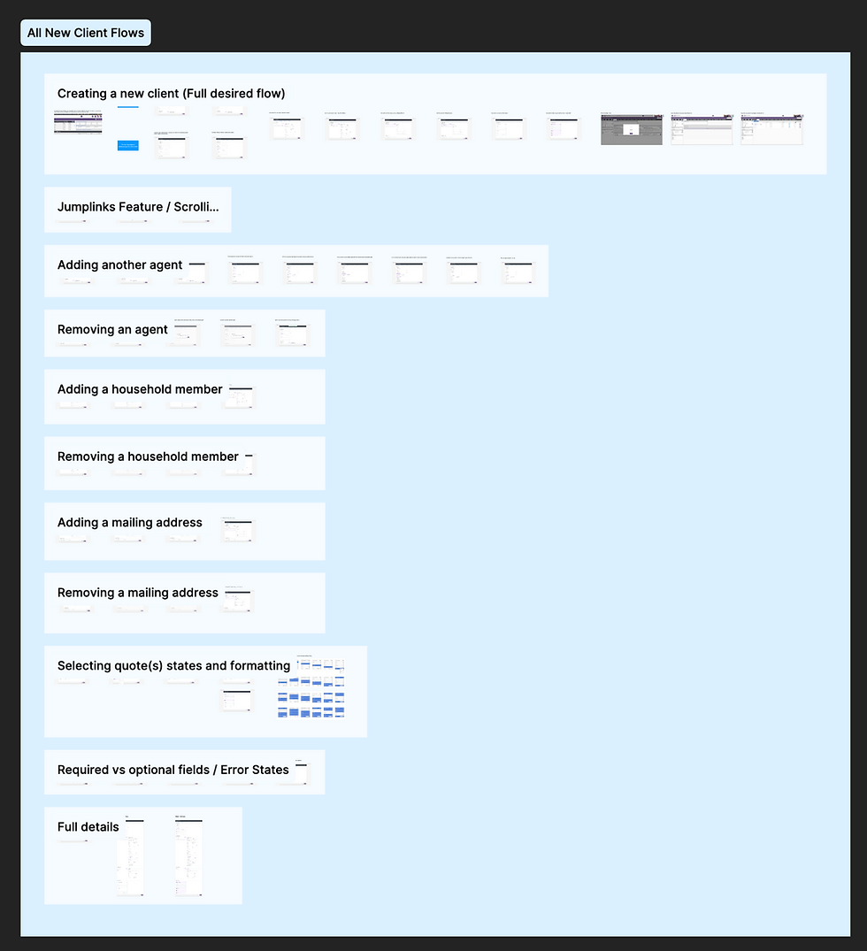
We begin with very low-fi wireframes of the user flows. We sectioned out each flow into separate sections to help us maintain focus during our review sessions and stay organized. Figjam is excellent for this part of the process as all participants can comment for edits or changes and we can keep all iterations of the process in one file.


03
Mid to Hi-fi
Once pages have been refined, we have now moved into Figma and are creating design systems, components, and making sure things are consistent across the board. At this point, we are still reviewing regularly and making edits until it is ready for prototyping with users who have not been included in the design process.
PRototype
The high fidelity wireframes are linked and prototyped together to emulate how it will actually function in the product. We now take users through more extensive testing, asking them to go through specific flows without leading them in any direction to ensure that the design speaks for itself. As designs are validated, they are gradually spec'd out with every single detail to be delivered to developers, including all component states, every possible use case, detailed explanations of each design with hex-codes and dimensions.
![[Internal Review] 2-Factor Authentication 12.7.22.png](https://static.wixstatic.com/media/0d89d0_c10700c57b8542ae906163c78066a184~mv2.png/v1/fill/w_980,h_705,al_c,q_90,usm_0.66_1.00_0.01,enc_avif,quality_auto/%5BInternal%20Review%5D%202-Factor%20Authentication%2012_7_22.png)


.png)


Testing & Analysis
What was successful?
We were able to update the input fields to be more easily accessible based on layout and sectioning them into steps. Users expressed interest in our concept of creating multiple coverage options in one application to be able to send to clients for consideration.
What was confusing?
While it is a good thing when clients know what they want and have opinions, it was a little difficult trying to bridge the gap of what they believed could be possible solutions and us explaining why we are considering other options due to the feedback from testing and design guidelines. There is a balance between respecting the client's expert knowledge of the product and our specific expertise in usability in which we were hired to perform.

What was surprising?
It was a shock to learn how many external steps the internal users had to go through to accomplish tasks. There were a plethora of pop up modules, links to third party sites, and use of split screens to accomplish their basic goals. Experienced users had learned how to work around the system, but new users were struggling to keep up.
What still needs work?
While we wanted to keep the UI clean and simple, we still wanted to improve the aesthetic of the product. We focused primarily on the information and layout for the time being because that was the highest priority and issue to solve, but were still in the process of creating a design system that didn't feel so mundane but rather immediately identifiable.

Final Thoughts
What did I learn?
One big lesson I learned was being able to back up my designs with justification and research. It is always hard to validate ideas when people have other points of view, but it is our jobs as UX designers to communicate our expertise and give the client reason to trust our decisions.
I was also reminded that things such as input fields and forms have already had extensive thought processes and reasoning as to which kinds work best for usability. Yes, context is important for this, but also there is no need to reinvent the wheel when standards have been set to follow. We want users to feel familiar and comfortable with the product and do not want to design new things for the sake of originality or creativity.