After
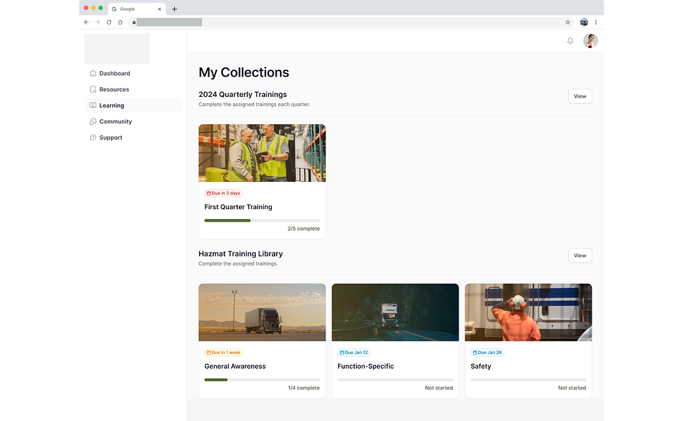
Before


Safety & Compliance Learning Web App
This connected learning platform for safety and compliance focuses on the use of data intelligence and the psychology of learning to improve the retention of compliance and risk training across the workforce. We were tasked with visually modernizing the platform for professionalism while also trying to improve pain points brought up by real current users, both on the front-end and the back-end.
The company prides itself on its whimsical nature, grounded in trying to make safety training more fun and digestable rather than a wall of words or a monotone video that goes in one ear and out the other. Their foundation in psychology gives them a leg up over their competitors, but they were losing a fighting game due to their late 80's web design and poor organizational hierarchy of information.
Role
UX Designer
Date
July 2025 - Sep 2025
DiscoveR
Who are the users and what are their goals?
Audit of Current System
Time to document the current layout and organizational hierarchy of the platform. What can we understand as people who do not have previous knowledge of what things do and what needs to be explained? How do their design standards hold up to the modern day? Are elements consistent and are things easy to navigate?
Novice User
Brand new
Just got hired, needs to get up to speed and certified. Primary goal is to complete their requirements.
Never used platform before
Fairly likely
Typical User
Familiar
Been employed, trying to meet standards. Could include annual training to be re-certified. Has previous history of lessons.
Has used platform before
Most likely
Ambitious User
Experienced
Very experienced, wants to gain extra certifications to gain higher position, looks for additional resources and active on boards
Seasoned user
Less likely
Admin User
Client Facing
Admin for the company utilizing the platform, in charge of managing their specific group of learners, may make regular announcements, determines what access to content users have.
Management
Few, but necessary
Admin User
Internal Facing
Developers/content creators/founders, should be able to manage all learning content and users, ability to make edits to the platform itself, view user analytics
Company Led
Confirmed
CEO Interview & Demo
The client expressed their passion for the project due to their background in psychology and their hopes for where the platform could grow. They were very proud of how far they had come, but expressed disappointment in the UI not looking professionally reliable to current clients. They also expressed that they had just hired a new project manager that would be our direct contact from then on due to their busy schedules.
DEfine

User Flows
To help visualize user flows, we created a chart to identify all possible avenues that we needed to account for. This includes edge cases, such as users who work for multiple companies that contract out the platform, errors, verification, and creation.

Identify Pain Points
We created a notion table of the pain points revealed through the many user interviews and walkthroughs we did of the system. These issues were then categorized into what type, level of priority, status, for which persona, and action items to be completed.

Navigation and IA
Due to the nature of the disorganization of the system, we spent extensive time considering the grouping of items and how the menu / primary nav should be laid out. This was a collaboration effort from our team and the project manager based on feedback from internal employees and front-end users.
IDEATION
01
Wireframing
We begin with low-fi wire-framing of the sign in flow, starting with mobile, because it is the primary mode of access for their users. Later on, we scaled up to tablet and desktop. We considered the primary objectives of the user and possibilities for gamification.


03
Mid to Hi-fi
Once the screens were refined, we re-created the flow charts we made at the start with the updated screens. This included all possibilities of 2FA, errors, third party sign in, and account creation. The tablet and desktop versions were also updated and added to the specs for development.


02
Internal Review
As the wireframes evolved, we continued weekly reviews and edits of the possible options until the screens were satisfactory enough to be moved into higher fidelity. These considerations were validated by the project manager and other members of the internal team.

PRototype
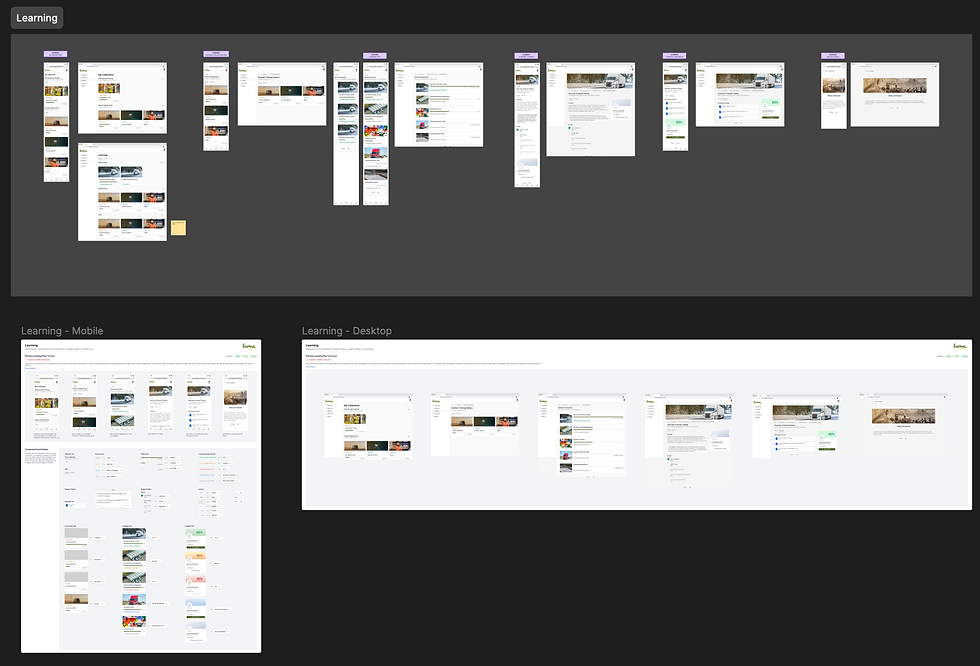
We prototyped both the mobile and desktop versions of the product, since mobile is the primary mode of access for front-end users and desktop for back-end users. This prototype was used for testing and for presenting to the stakeholders as an indicator of future progress of the platform. The prototype took the user through the primary flow of signing in, selecting a collection to continue to complete training, and viewing their current status of to do items. All of the collections were updated with more professional imagery, consistent components, and the brand's mascots to maintain playful energy alongside the gamification aspects. These screens were then spec'd out for the developers with call-outs and context of the pages.
![[Internal Review] 2-Factor Authentication 12.7.22.png](https://static.wixstatic.com/media/0d89d0_c10700c57b8542ae906163c78066a184~mv2.png/v1/fill/w_980,h_705,al_c,q_90,usm_0.66_1.00_0.01,enc_avif,quality_auto/%5BInternal%20Review%5D%202-Factor%20Authentication%2012_7_22.png)

.png)




Testing & Analysis
What was successful?
The new sign in and onboarding process was a hit! Smooth usability and high praise for the UI and aesthetic updates, especially the inclusion of their playful nature and animations. The modernization of the platform was heading in a great direction.
What was confusing?
Due to the fact that our team was communicating directly with the project manager and the CEOs were not included on the weekly calls because of their schedule, there was a miscommunication of the progress of our designs. The higher ups wanted to focus on visual updates and were confused on our ideation for possible navigation updates. This led to reorientation of objectives. There seemed to be a disconnect between the feedback of external users and the viewpoints of the internal company.

What was surprising?
Although we were aware of the outdated designs they were working with, we were surprised to learn the vast differences of content creation that were not made consistent across the platform. It was a good thing to keep users interested in content, but caused lots of issues for the development team to maintain for longevity.
What still needs work?
To create mock ups of the proposed system, it became difficult to merge concepts into one single idea to convey the journey properly. Since compliance has so many different kinds of lessons and ways to display the information, it felt like we had to work harder in order to create a simplified version for testing that accurately portrayed the scenario. It was also hard to create components that were flexible enough to be used for all types of clients. Eventually we came to a solution that we felt delivered without compromising on uniformity, but was still easy to test.
Final Thoughts
What did I learn?
This project was a big lesson for me in the importance of company hierarchy and transparency of communication. Although everyone was aware of who we were expected to report to and the availabilities of each party, there should always be regular check-ins with the higher ups of the company to make sure we are on the same page on priorities.
Although we were proud of the direction we were going and were not making design decisions lightly, we should have had the hindsight to know that both our team and the project manager were new to working with the company. Above all, we needed to prioritize keeping the integrity of the product through the ones who created it and who are deeply passionate about the content. A proper design cadence is integral to maintain transparency.