After

Before


Game Development Platform
On this project, we were tasked with a complete overhaul of the internal management system of a gaming development company. The developers built their platform from the ground up, but as the games grew more complex and the amount of data became too difficult to parse through, they realized that organization was direly needed.
This was a challenging, but extremely rewarding project to be a part of. I had to learn how to communicate with developers who knew how to create in their own way and had vast knowledge of the system they created, but did not know how to translate that into proper usability for the long term. Together we refined the system through a revamped sitemap, lots of iterations and reviews for each section, and a beautiful visual system to blend it all together into one product.
Role
UX Designer, Information Architect
Date
Nov 2020 - Mar 2023
DiscoveR
Client Interviews & Demos
The client walked us through the actual product and how they interact with it on a regular basis. They discussed the purpose of their work and the scope of the project. After this, we worked together to establish goals, set a proper design cadence of when and how to review ideation and delivery, and what timeline expectations were.
Who are the users and what are their goals?
Through interviews with their development team, we identified three subsets of users to focus on and base our user flows and personas.
-
Developer (primary)
-
QA
-
CS
Audit of Current System
Did they have a site map or any type of IA? We learned that their sidebar menu had an alarming amount of items that needed to be consolidated and organized. After identifying the current hierarchy of menu items and pages, we created a visual sitemap to begin the work of figuring out if items were arranged properly, could be merged into others, or served their proper purpose. They also gave us access to their stage environment for our own perusal.
DEfine

User Flows
We worked collaboratively with the development team to refine each persona's user flows. Developers dealt with code, game logic, and stage environments. QAs dealt with player accounts and functionality. CSs dealt with player interactions and game items.
Identify Pain Points
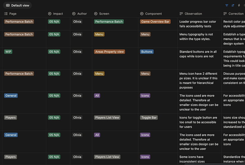
We created a notion table of the pain points revealed through the many user interviews and walkthroughs we did of the system. These issues were then categorized into what type, level of priority, status, for which persona, and action items to be completed.

Work Pipeline
As an internal design team, we delegated action items and created a kanban board to keep track of the status. This helped us stay on track and to be aware of each other's progress apart from our meetings.
IDEATION
01
Wireframing
We begin with very low-fi wireframes of the user flows. Most often, this is done in Balsamiq and in black and white to maintain focus on the flow rather than any aesthetics. Priority is if the process makes sense and if items are easily understood without context.

03
Mid to Hi-fi
Once pages have been refined, we have now moved into Figma and are creating design systems, components, and making sure things are consistent across the board. At this point, we are still reviewing regularly and making edits until it is ready for prototyping with users who have not been included in the design process.

02
Internal Review
These wireframes are refined to be presented to the client, tested, and reviewed. At this time, we document any edits that need to be made and we repeat this process continuously to include more secular details until we get a satisfactory design to move to hi-fidelity.

PRototype
The high fidelity wireframes are linked and prototyped together to emulate how it will actually function in the product. We now take users through more extensive testing, asking them to go through specific flows without leading them in any direction to ensure that the design speaks for itself. As designs are validated, they are gradually spec'd out with every single detail to be delivered to developers, including all component states, every possible use case, detailed explanations of each design with hex-codes and dimensions.
![[Internal Review] 2-Factor Authentication 12.7.22.png](https://static.wixstatic.com/media/0d89d0_c10700c57b8542ae906163c78066a184~mv2.png/v1/fill/w_980,h_705,al_c,q_90,usm_0.66_1.00_0.01,enc_avif,quality_auto/%5BInternal%20Review%5D%202-Factor%20Authentication%2012_7_22.png)

.png)


Testing & Analysis
What was successful?
Users expressed an overwhelming positive reaction to the new UI, especially grateful for the dark mode which is so popular in their field. The organization of the sidebar menu was also well received, noting that items were grouped intuitively and helped reduce the number of actions or scrolling. Using collapsible containers to deal with multiple levels of data was much more easily understood and digestible.
What was confusing?
While the data was better organized and easier to read, there were still questions in the air about how to handle all of the various types of data (such as vector, array, string, number, list) and how to differently display them in the same area. Also for our handoff, it was a challenge to be on the same page as the developers as they were implementing our designs in the stage environment while still making final edits from feedback at the same time.

What was surprising?
Because users were so accustomed to the original system, we found that they had their own ways of working around any issues that were present-meaning that they would take the long way to do things or come up with shortcuts that we did not take into account. This made the transition to proper UI a little disorienting. Also, the difference between front-end and back-end for gaming platforms is quite different from e-commerce or business, which was an adjustment.
What still needs work?
Due to time constraints and budgeting, we were not able to get as much progress done on the admin side of things. The admin section is a separate section with its own menu items. We were able to update the UI to match and get some accomplished, but some features were deprioritized. We also learned a lot about the best handoff for spec delivery. This was when Figjam was still pretty new and did not have the built in feature for inspecting. For future projects, we learned how to document all of our progress and organize our files to be more efficient.

Final Thoughts
What did I learn?
During this time, I learned a lot about how to communicate with minds that work or process very differently from mine. What makes sense to us in the UX world does not always translate to the coding world, but we must work together to build a product that merges those ideals together in a well intended balance.
I also learned valuable skills in how to deliver and spec out my designs to be well understood for all use cases. Organization and context is key when teams are working remotely and at different timezones. And finally, I learned that a complex issue does not necessarily need a complex solution. It is important to ideate, but too many ideas becomes a lack of consistency when you do not refine with purpose.